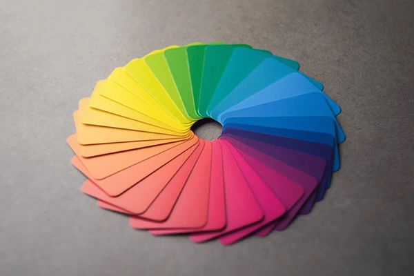
Have you ever wondered how your focus and productivity change at different places? And this is not just about the room or the place, what works behind this is colours and their psychology.
Especially for students, such proven practices can help them out not just to make their room beautiful but to increase their productivity, focus, and mood. From completing their homework to preparing for their exams, color psychology can really make things easier.
You might be questioning – But what color to choose for a specific desired outcome? What is the best color and how to decide my palette? Don’t worry. Just go through this guide to understand this colour psychology for students.
Key Takeaways
- Light, calming colors such as light blues can help students increase their attention.
- Productivity can be managed by pairing calm colors with subtle accents to create depth.
- Lightings and the right placement of furniture also decides how we are going to work and act on the same things.
- Red and yellow shades can work well for creating an energizing ambience.
How Color Shapes Study Habits
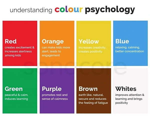
Colors can be categorized into two categories: Light and those with intense and dark contrast. Soft, light, and low-saturation colours can calm your mind; you will not easily get affected by things. While highly saturated shades can feel demanding over long sessions. To be more attentive and lower your anxiety, light blue and green colours should be used. If you’re choosing colors for study room walls, think “quiet, cool, and light” before bold and dramatic.
While setting up your space, keep your study workflow simple: plan, draft, revise. If writing is part of your routine, you might use a helper for proofreading or structure. Some students prefer to pay for someone to write my essay when deadlines stack up; place the note in their to-do list and keep their focus on color tests and layout tweaks for now.
The Best Study Room Paint Colors (And Why)
When selecting study room paint colors, aim for cool mid-tones and soft neutrals. Light to mid blues often support sustained attention and mental clarity. Sage and other soft greens help with balance and reduce visual fatigue during long reading blocks. Pale yellows can add a little warmth for brainstorming, best as an accent rather than the main paint color for study room walls. Neutral bases—off-white, linen, or soft gray—keep glare low and distractions down.
Intensity matters as much as hue. A muted blue-gray can calm, while a super bright electric blue may feel pushy over time. The same goes for red: small accents can energize a common zone, but large red walls near your desk can wear you out during deep work.
| Quick Color Table for Student Spaces | |||
| Color family | Role in a study room | Where it fits best | Notes |
| Light–mid blue | Focus, mental clarity | Main walls | Keep saturation moderate |
| Soft green | Calm, lower eye strain | Walls or curtains | Good for long reading days |
| Pale yellow | Optimism, idea spark | Small accents | Use in trims, art, or a niche |
| Off-white/linen | Bright, low distraction | Walls/ceiling | Adds light without glare |
| Soft gray | Neutral balance | Walls, big furniture | Pair with blue/green accents |
Light, Finish, And Placement Tips That Help Concentration
Paint color and light are synonymous. Light-reflecting paints (eggshell whites, pastel blues) will reflect daylight around the room and make a small room seem larger. If you have a very low sunny-hour annual total, use pale sages or soft creams to blur the cave-like environment. If you prefer a richer color, use just one accent wall at the room’s rear end behind the desk so that it’s out of your direct line of sight.
Finish work counts too. Eggshell or satin washes easily for high-traffic areas, but new washable mattes provide low glare with superior cleanability over vintage flat paints. Low-VOC choices enhance indoor air quality—good for compact dorms and cramped apartments.
A Simple Process to Find Your Best Palette
Testing beats guessing. Here’s a tight method for choosing study room paint colors that work all day:
- Shortlist three hues (one blue, one green, one neutral).
- Paint letter-sized swatches on different walls at eye level.
- Observe morning, midday, and evening. Note your mood and alertness.
- Keep the one that supports calm focus; use the runner-up as an accent.
- Add a desk lamp test: check how the hue reads under warm vs. cool bulbs.
Interesting Fact
Research has found that students surrounded by light colors, such as blues, can easily pay attention for a longer time.
Color Combos That Work For Focus And Creativity
Pair a quiet base with a deeper accent for depth without clutter. Try these sets:
- Silver gray + navy trim + white shelves for a modern, distraction-light look.
- Pale taupe + forest green curtains to soften a small room while keeping focus steady.
- Linen white + sage walls + natural wood for a calm, organic feel.
- Beige main + rust or muted coral desk niche to warm up a brainstorming corner.
If you’re asking what color increases focus, a light to mid blue is a reliable main wall pick, with greens and soft neutrals close behind. Keep high-chroma colors in small doses.
Small Room Playbook: Fast Wins
- Paint the ceiling one shade lighter than the walls to add visual height.
- Use a single dark accent behind the monitor; keep side walls light.
- Add plants for green cues without repainting the whole room.
- Choose matte or washable matte on big walls to cut glare during screen time.
- Keep art simple: two or three prints in one palette, not a busy collage.
Sample Palettes For Different Study Styles
| Study style | Palette | Why it helps |
| Deep reading & long essays | Wall: soft blue-gray; Trim: white; Accents: navy | Calm base with subtle depth for long sessions |
| STEM problem sets | Wall: sage; Ceiling: off-white; Accents: charcoal desk | Balanced green reduces fatigue during multi-hour sets |
| Creative projects | Wall: linen; Accent niche: pale yellow; Wood details | Neutral field with a warm spark for idea generation |
| Shared dorm corner | Wall: warm gray; Curtains: soft green; Shelf: white | Neutral shell that plays well with mixed furniture |
Conclusion
Choosing the right color in a student’s room as a paint can show various impacts on his/her productivity and results. The right colour can change their mood and allow them to come out of the common problem – not being able to focus and not feeling like studying.
Calm blues and greens can be mixed with soft neutrals to create a studying environment. Such small adjustments from colour combinations to fixing lighting can make a huge difference.
Which is the best color to increase their focus?
Light colors, including light blues and soft greens, can reduce stress and increase focus.
Is it necessary that the ceiling color match the walls?
No, it is not necessary to match the ceiling color with the walls. Although for a better look, the color combinations should be perfect.
How do neutral colors work?
Neutral colors like off-white help to keep you less distracted, and these colors pair well with light blues and greens to create an overall effective environment.
Is it proven that colors affect productivity?
Yes, research has been done to prove this. Colors really affect our mood and productivity.