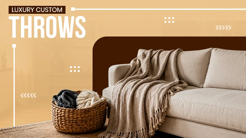
KEY TAKEAWAYS
- Colors have a direct impact on our emotions.
- Warm colors signify passion, happiness, and excitement.
- Navy blue is known for its concentration and disciplined nature.
- Dark colors create an intimate and dramatic space.
- Understanding color combination and light effect is vital.
“Colors, like features, follow the changes of the emotions.”
— Pablo Picasso (Spanish painter and sculptor)
People don’t realize it, but colors hold a lot of power and each one of them is used for a special purpose or signifies something. According to WikiHow there are over 10 million colors on our planet, but people usually know about 7 that are in the rainbow.
Let it be a common color like red, yellow, while, or something unique such as amaranth, bistre, or celadon; they all have a purpose and are used for different things. When someone is getting their home painted, they should know how it affects it.
That’s why in this article, I’ll be mentioning how pain colors affect your home’s ambiance.
The Science Behind Color and Emotions
Colors are not jut visually appealing, they carry different emotions and those can be triggered in humans when they are encouraged with any such paints. We are slightly sensitive to them, and we react on seeing them unintentionally.
If we talk about its science, psychology they affect our mood and energy either in positive or negative way. Some might make us feel calm or boost our energy, and some might worsen our mood when we are already down.
People who like to paint should know about best paint by numbers, as they can help create masterpieces without requiring previous experience.
The Power of Warm Colors: Red, Orange, and Yellow
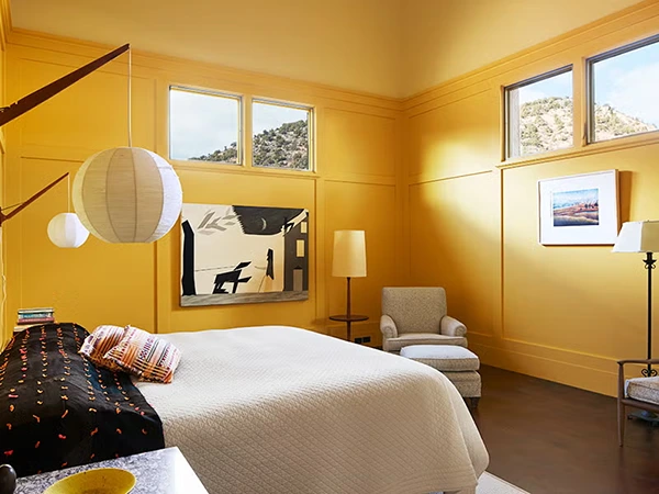
Let’s start our colorful journey with warm tones. Shades of red, yellow and orange crates, a sense of energy and warmth. They also represent passion, happiness and excitement. Now just think about it, a room colored orange, how would it make us feel?
It will cheer anyone up and is usually perfect for kitchen or dining rooms as it creates a welcoming surrounding. Yellow is known for spreading creativity and can be used in playrooms or other parts where brainstorming is done.
Red, on the other hand, can significantly increase heart rates (positively) and revive our emotions, making them best for a home office or gym.
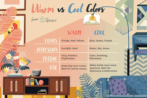
Cool Colors: Blue, Green, and Purple
Cool palettes like blue, green, and purple encourage relaxation and calmness. Starting with blue, it flowers the blood pressure and spreads peace is also associated with water, sky and snow which usually makes give us soothing or refreshed feeling.
Green is affiliated with nature and showcasing harmony and balance, it brings out the feel of outdoors in a room, which is ideal for the living area. Dark green can be used in the dining area as it is suitable for formal corners.
For the royal feel, purple is what everyone needs, and its light shades, like lavender, spread peacefulness, a must for bedrooms. In the infographic below, the major differences between the warm and cool colors are mentioned.
Neutral Colors: Beige, Gray, and White
Neutral colors such as beige, gray and white work like an empty canvas that is versatile and timeless. It lets others shine in their presence and goes well with any style or design. Beige gives a cozy and inviting feel and should be used in living areas to make other feels comfortable.
Another great thing about this shade is that it pairs up with anything, so vibrant furniture will go perfectly with it. Gray is the new favorite choice for modern interiors. It adds depth to any place. Its lighter shades generate a clean, airy feel, but dark ones are known for a dramatic and intermediate vibe.
White is endless and can make any space feel bigger and brighter. It can also be utilized to highlight artwork in the home.
Dark Colors: Black, Charcoal, and Navy
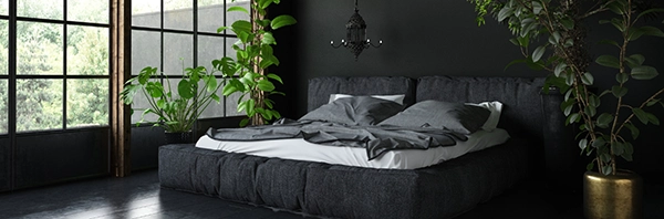
Many might think that dark colors create a creepy vibe, but they are wrong. Shades of black, charcoal, and navy are best for a dramatic or intimate atmosphere. They are in-demand choices for rooms that want a deep, luxurious, sophisticated feel.
Black is an all-time classic, which lets other elements in the room have the spotlight. Its lighter alternative, charcoal black, adds richness to the room without overpowering anything. If paired with a light or metallic color, it will create a perfect fusion and contrast.
Navy blue, which is usually the color of formal outfits, creates a sense of discipline and concentration, which are considered perfect for study areas.
The Role of Accent Walls and Color Combinations
Accent walls are those that are different from every other in a room. A lot of experiments can be done with them, and it would be the only ones that will stand out it could either be in vibrant or dark shades, ultimately, it will create a statement piece.
Color combination matters a lot as they can create good contrast or represent a story or statement. Professional advice can be taken on this matter so that they can tell individuals what should they choose and how would it look.
How Lighting Affects Paint Colors
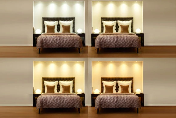
Lighting plays a crucial part as it can change the feel of any tone. Natural sunlight can make colors look bright or vibrant; artificial sunlight, on the other hand, can make it cold-looking or warm. Keep in mind where colors are being used and what impact they will have on them.
If they are matching the individual needs or vision, it’s all good, and if not, consider changing the shade or the lighting, whichever is more convenient.
FUN FACTIn the Stone Age colors were made up of natural pigments like rock, soil, charcoal and animal fat was used to mix them and bind them together!
Conclusion
Colors hold a lot of power, and without them, our lives will be dull and boring, just like the old black & white televisions. It’s important to understand their dynamics and where they are used.
They can make any place lively or look attractive. Whether it’s a small apartment or a big villa, colors will play a crucial role in its overall look. If anyone is unable to understand how the combination works, they can search it online or reach out to professionals.
How do paint colors affect our mood?
The tone of shade, either warm or cool, has an impact on our emotions. Warm tones tend to excite us, while cool tones calm us down.
How does color affect the house?
Color tone represents several things and creates different atmospheres based on what color is being used and where it was used.
What paint colors make you happy?
Shades of yellow, orange, red, and pink are said to have a happy and positive impact on our brain that elevates our mood.